Introduction
Welcome to your portfolio-building journey! Whether you're a seasoned developer or just starting out, creating a strong online presence is crucial. We want to take this opportunity to guide you through the basic of building a project portfolio website to display in less than a day. You wouldn't want a year's worth of hard work go unoticed don't you?
No coding experience? No problem! We'll start with the fundamentals and gradually build up your skills. At any point if you encounter problem, you can reach out to the teaching staff, your Teaching Assistant, or even your friends for support, iDP is the friends you made along the way afterall.
Note
This is only meant as an introduction to very basic thing that you could do with front-end technology for those who don't have much experience with website development or don't want to spend too much time to figure it out.
You do not have to follow this tutorial, if you already know the fundamental of web development and are confident in your skill in creating something much better than this.
By all mean feel free to show us your creativity and pride for your project, the world is your oyster.
Installation of development tools
Visual Studio Code (VSCode)
The first thing that you would need is a text editor. For more complex projects you would probably need an Integrated Development Environtment (IDE) instead, but for the purpose of this portfolio a text editor is more than good enough. The official text editor that will be supported in this course is VSCode due to its popularity, ease of configuration and useful plugins.
To download VSCode, just follow the instruction provided on this website VSCode.
Here is a basic Youtube tutorial for those of you who would like to learn a bit more about your new shiny text editor: VSCode Tutorial.
It is advised to get somewhat comfortable with using VSCode as it is quite an industry standard for programming, and it also will make your life easier in general.
VSCode extension
VSCode has a lot of what we called extensions. They are essentially package or "app" that is written by other people to help extend the functionality of VSCode. For this tutorial, we will install an extension that helps us with live previewing our website. Without this plugin, we would need to click reload on our browser everytime we made a change to the website, which is not very fun to do every 5 minutes or so.
Note
By default, your TASKBAR should be on the LEFT OF THE SCREEN.
In all of the VSCode image going forward, the task bar is displayed on the right side of the screen due to the author preference (I would recommend you to also put taskbar on the right to improve code readability), this is purely for User Experience purpose and does not affect the functionality of VSCode in anyway.
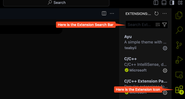
Click on the extensions Icon as shown above.
Type in the Extensions Search Bar section: Live Server
Open up the results that say:
Live Server
Ritwick Dey
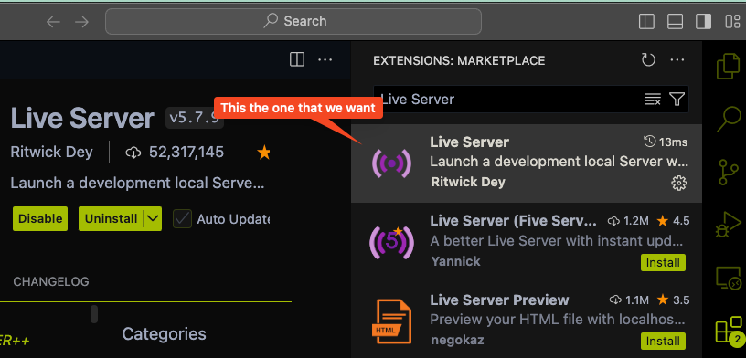
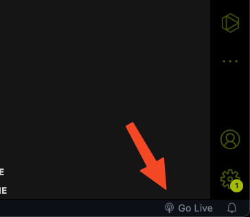
Just click the Install button and you are set. You should be able to see a small broadcasting symbol at the bottom of the VSCode window (usually on the bottom right) that looks like this.

Git
Next you will need to learn how to use a version control system or source control management (scm) depend on who you ask. In this course, our official supported scm is Git. Please visit the link provided, and follow their instruction to set it up on your computer.
If you are wondering what is Git and want to learn more about this very important industry standard tool, here is a link to a great introductory video to Git by Brian from Harvard CS50 course.
Github
Please sign up for a Github account at Github. Github is where you can upload your own git repository or download other git repository (think dropbox or Google Drive but for code). This is also where your websites and all the resources for this tutorial will be hosted FOR FREE!!!
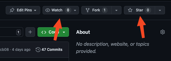
While you are at it, remember to give a star to this tutorial and watch us on Github. It would give us some internet clout :"), but more importantly it will notify your account and your email if new update is made to the tutorial so you can keep an eyes out for it.
Chapter 1: Overview
In this chapter, we will learn how to use the basic template that is provided in this course to generate a simple portfolio and hosted it on Github for everyone to access over the internet.
Here is an overview of what this chapter will cover:
-
Setting up your local development:
- Creating a working directory for your website and open it up in VSCode.
- Checking that all your installation works.
-
Setting up your Github repository:
- Forking the template and cloning it locally to your working directory.
- Set up syncing on Github between the original template and your fork.
- Set up the website on Github pages.
-
Working with basic provided components:
- Working with text
- Working with team members
- Working with table
- Working with images
- Working with embedded videos
- Working with references
- Working with table-of-content
Setting up your local development environment
In this section, we will learn about how to set up your local development environment so you can get used to using basic functionality provided by VSCode as well as how to open folder, create and delete file, and using Live Server to host a local website.
Note
By default, your TASKBAR should be on the LEFT OF THE SCREEN.
In all of the VSCode image going forward, the task bar is displayed on the right side of the screen due to the author preference (I would recommend you to also put taskbar on the right to improve code readability), this is purely for User Experience purpose and does not affect the functionality of VSCode in anyway.
Step 1
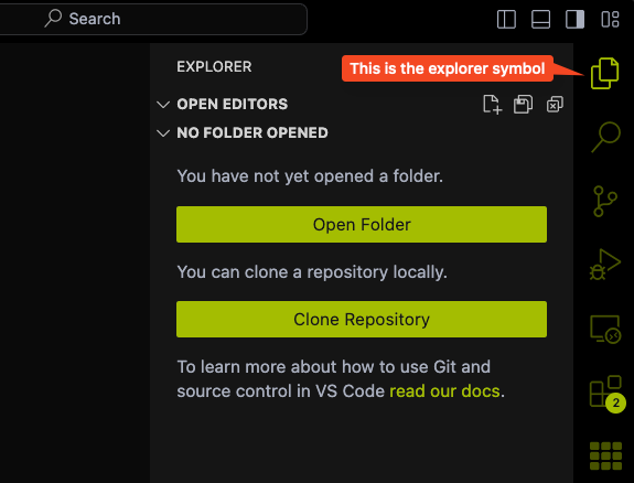
First, open up your VSCode and click on the Explorer icon to open up your working folder.
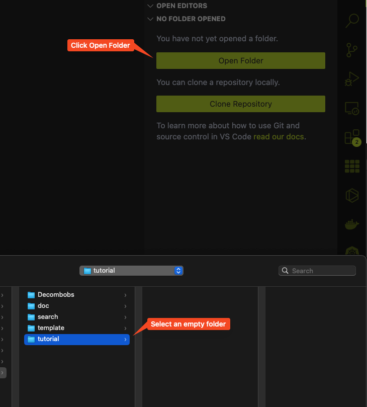
Next, click on the Open Folder icon to select a folder you want to put your website inside and open it up in VScode.
Warning
Please make sure that the folder you are selecting is EMPTY, else your website might not work.
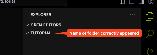
You know that it open properly when you see the name of your folder reflected in the explorer.
Step 2
Now we will try to create a new file and name it index.html in the folder.
To do so, just simply, right click on the empty space in the explorer and you should see an option for New file... pop up. Click on that and it will create a new file in the folder for you. Then, you can name the file index.html. Double click on the file to open it up in VSCode.

Step 3
Now let try to add something into the file so that we can test out our Live Server plugin. You can click on the Explorer icon again to collapse the side bar so it does not take up too much space on your screen. Copy and paste the following code into the file.
<body>
    Hello my project's website!
</body>
Note
All the code snippet in this tutorial like the one above can be easily copied using the copy button on the right of the snippet box. To show the copy icon, you just have to hover your mouse over the code snippet and it will appear. We suggest using this instead of highlighting and copy to prevent error.
Press Ctrl + S (or Cmd + S if you are using a Mac) to save the file and you are set.
Step 4
Now let see the magic of the Live Server plugin. If you click on the Live Server symbol at the bottom right of your screen, you will see it says Starting... and finally open up a brand new browser window with the index.html file you just created on it.
You should be able to see on the browser the sentence:
At the address 127.0.0.1. Now, you can freely close this browser window if you woud like to. If you want to open it again, just simply type into your browser search bar the following address:
localhost:PORT
Where the port number is the PORT value given by the Live Server plugin display at the bottom right of your VSCode like so.
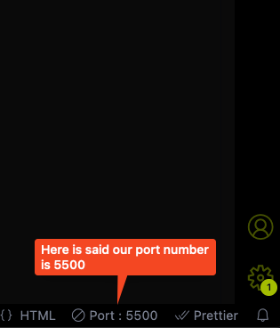
So in our example, that would be:
localhost:5500
And it should open the browser right back up.
Step 5
Now, the reason we need Live Server Plugin is so that we can simplify a process often refer to as "Hot-reloading" meaning that we can see the change being reflected immediately on our local website, the moment we make a change to our code.
To test out this feature, you can randomly change the portion of text between the two <body> tag to something else and see it being change on your local website in real time. For example, let change it to:
<body>
    1 year sound a bit long isn't it?
</body>
Save the change you made to the file, and immediately see the new text being reflected on your browser window.
Now, remember, if you close VSCode, the Live Server will be disposed automatically and you would need to click on it to activate it again. You could also intentionally dispose it by click on it while it is running (you know it is running when it said PORT: XXXX). After disposing it, you will not be able to access the website locally anymore.
And that will wrap up this section.
Work with Git and Github
We will now learn how to use Git and Github to clone the template, make trackable changes and update to the codebase and finally deploy your website to Github for everyone to view it. If you have never done web development before, this will probably be your first proper website that you can show to other as part of your portfolio.
Setting up your Github
In the installation, we have asked you to create a Github account. Now, we will teach you how to set it up. The first thing that you need to is to go to this link and then fork the repository. This is actually where all the code to the demo website that was shown to you is hosted. You can consult this following guide from Github on how to fork a repository, if you prefer to learn from the source.
To fork a repo, you need to click on the fork button:
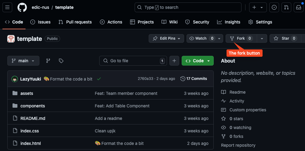
After you click on the fork button, it will take you to the fork creation page. Change the repository name to your project code, and then click Create fork:
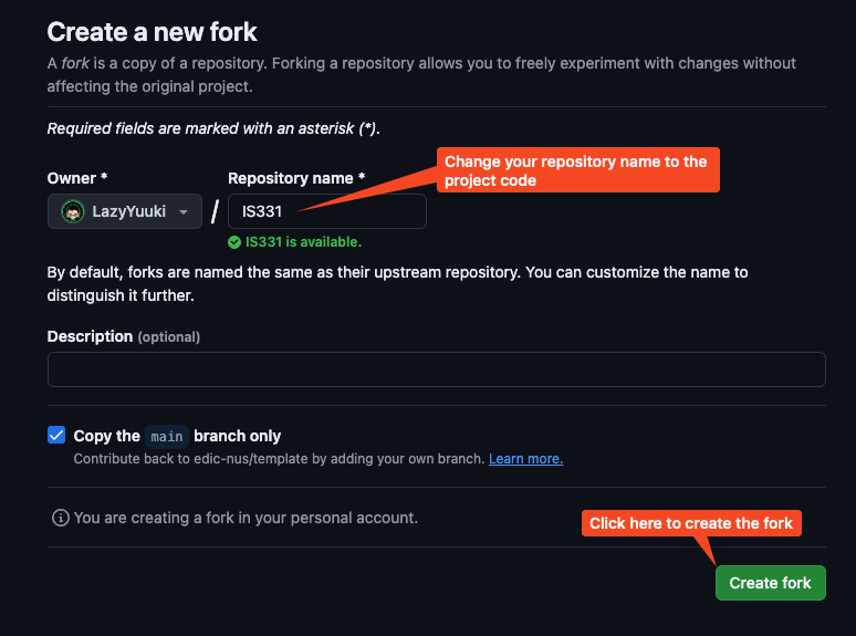
Now you should see the fork of the template being created in your Github with the repository name as you have give:
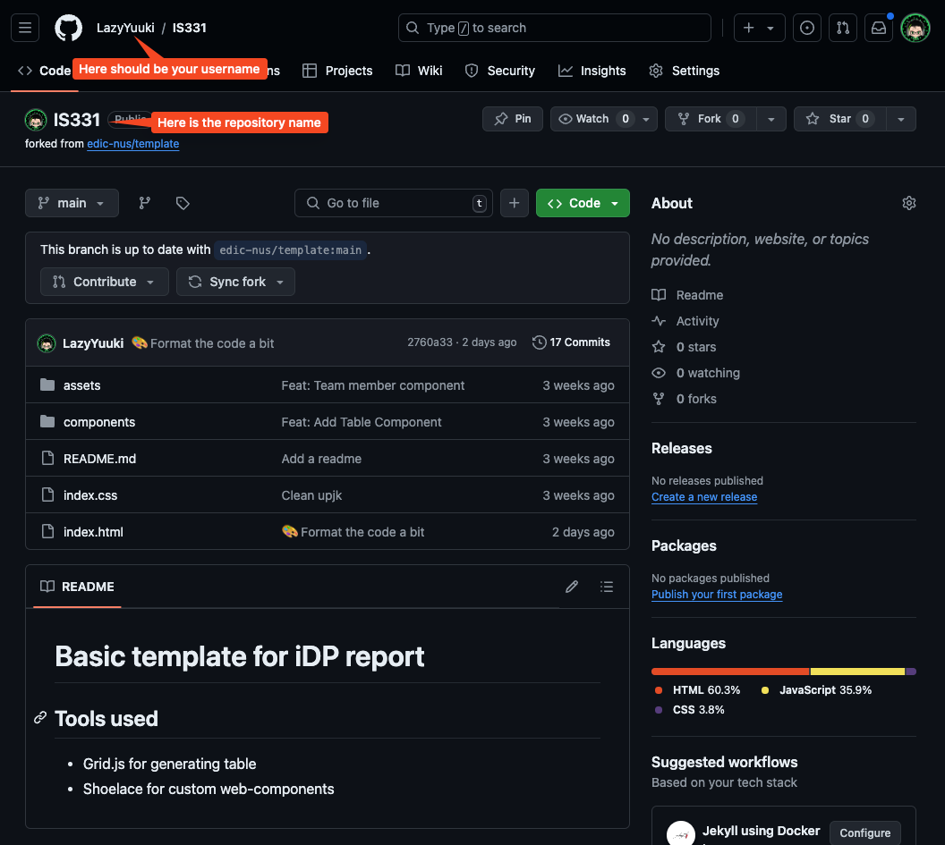
Deploying your website on Github
Now that we have the template code, let immediately set up the deployment of your website. Github has made it extremely simple to do so. Follow these steps:
- Click on the
Settingstab on top. - Click on the
Pagesoption on the left side bar. - Under the
branchoption under theBuild and deployment, change fromNonetomain. - Then finally click
Save.
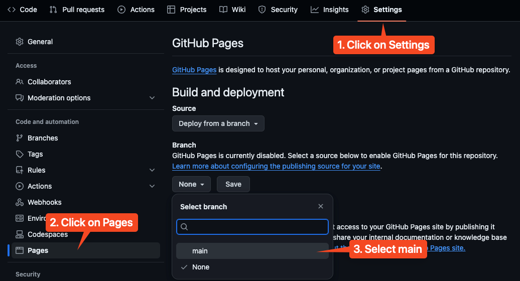
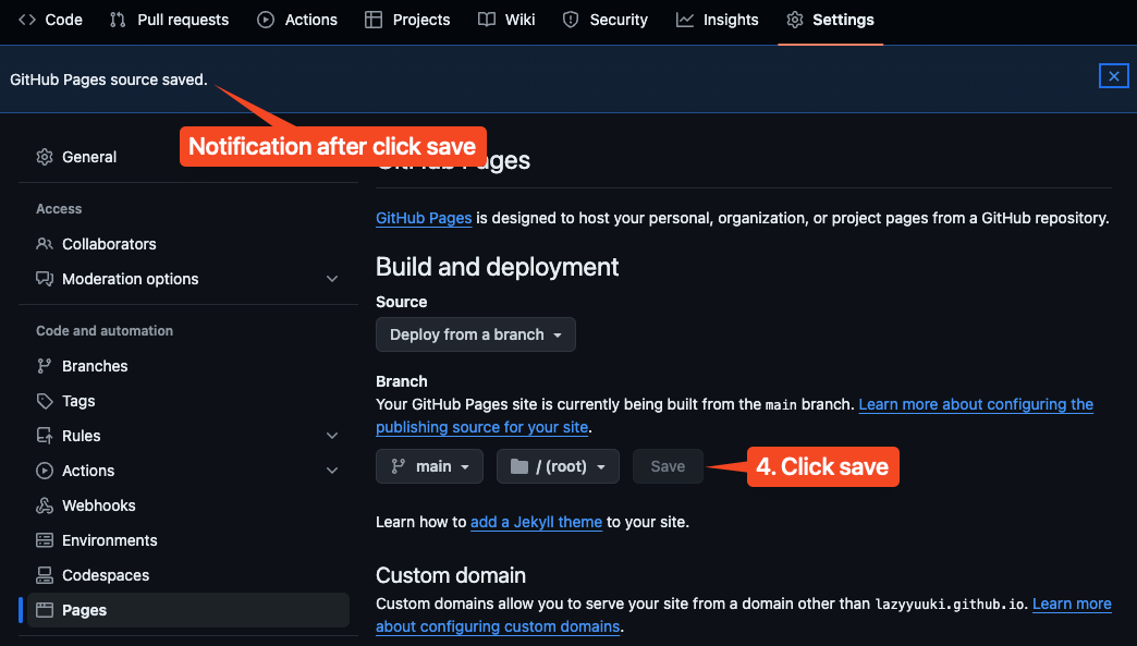
There should be a notification that pop up to tell you that the setting has been save, and your website should be deployed in around 1 minute. Next, navigate back to the Code tab, and monitor your Deployments.
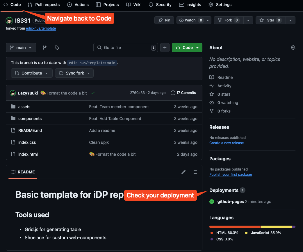
If the deployments show a gihub-pages with a green mark, that means your deployment is successful. You can click on it, and it will open up a page to show you the link to your brand new freely hosted website.
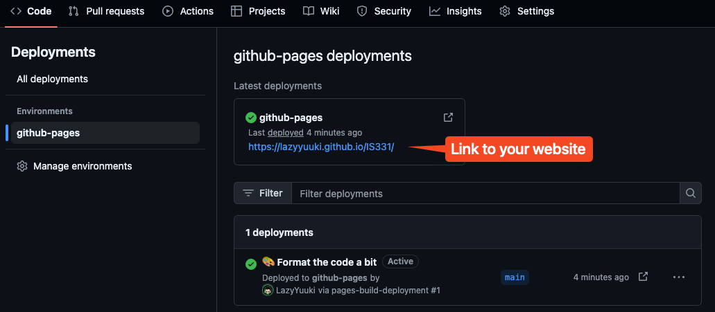
Congratualtions! You have successfully deployed your first website! You can share it with others and see that it should work on any devices with an internet connection. Fun fact, this is actually how a lot of technical blog, or just normal blog is being hosted for free, since it is easy to deploy and doesn't cost anything thank to Github of course.
Cloning the repository to your local environtment
Now, we will learn how to clone this repository online to our device to develop locally.
Warning
Please pay careful attention to this section, as setting your git up wrongly could really introduce a lot of headache and preventing you from moving onward, unless you know what you are doing.
If at any point, you think you did something wrong, or encounter error that you could not resolve. You can just simply delete the whole folder, and creating a new one again like in section 1.1.
We will refer to this guide here as we move forward with cloning our forked repository. On your forked repository, you should see a big Green button that say <> Code. Click on that, select HTTPS option, and click on the copy button to copy the link provided.
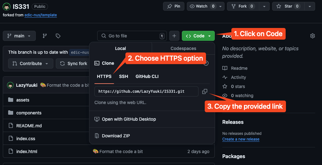
Now, open up your VSCode and your working folder we have created in the previous section. Delete your index.html file, or anyother file that you might have in that folder, so that we have an empty folder. Then, press Ctrl + ~ to open up your terminal.
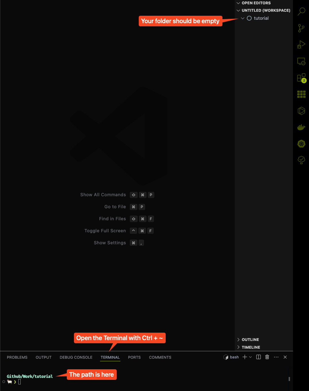
Don't worry if your terminal doesn't look like the one in the image. It is just the author own customization. But your path should have the name of your folder appear in the terminal, in this case it is Github/Work/tutorial.
Note
Your path might look more like this
~/some/path/to/tutorial. As long as the last word in the string that appear in your terminal is the name of the folder you create, you are good to go.
Now, in the terminal, paste in this command using the link that you get from Github earlier on:
git clone https://github.com/YOUR-USERNAME/project-code.git .
For example, mine would be:
git clone https://github.com/LazyYuuki/IS331.git .
Warning
Don't forget the dot
.at the end of the command above.
Press enter to execute the command, if it askes for a password, just enter your Github password, you should see the following output:
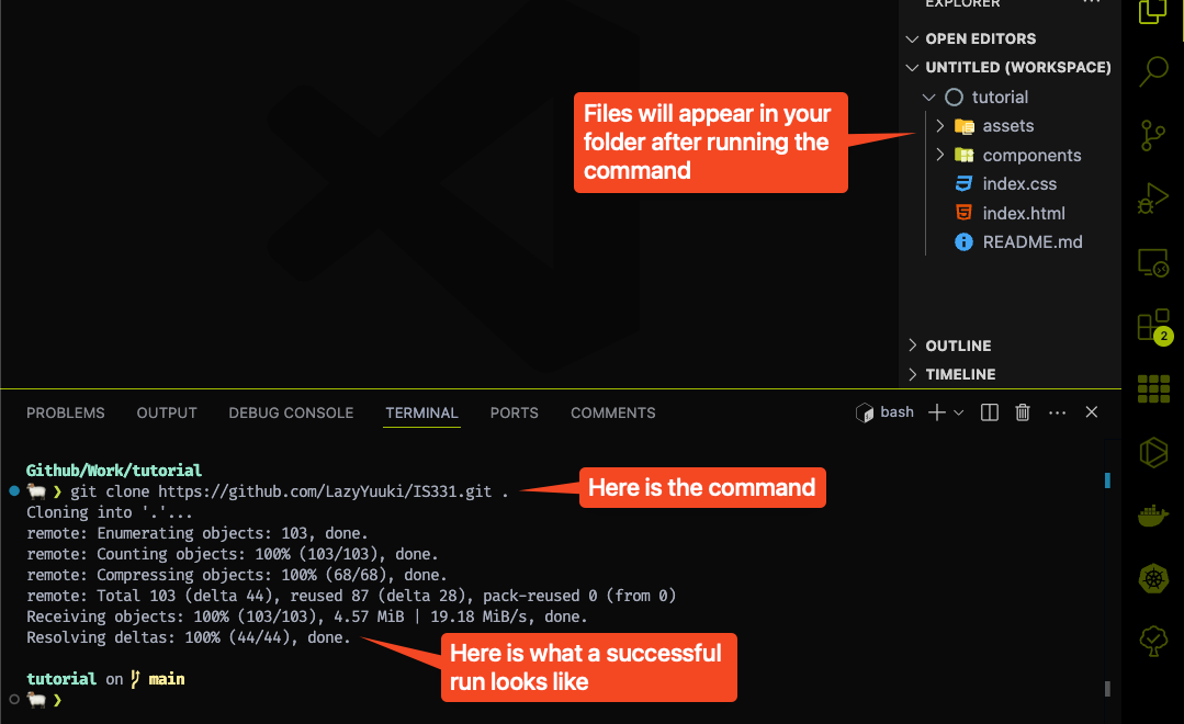
And congratulations, you have successfully bring the template code to your local environment for development.
Configuring git to update the template if there is a change to it
For the last step, we just have to set up our Git such that if the original template has any updates or bug fixes, you would receive it too. We will use this guide to set it up. In VSCode, execute the following in the terminal:
git remote -v
You should see something like this, but with your username and repository name instead:
git remote -v

origin  https://github.com/Username/Project-code.git (fetch)
origin  https://github.com/Username/Project-code.git (push)
Next, you should copy paste in this EXACT command:
git remote add upstream https://github.com/edic-nus/template.git
Afterward, just copy paste and execute:
git remote -v
And you should be able to see something like this:
origin  https://github.com/LazyYuuki/IS331.git (fetch)
origin  https://github.com/LazyYuuki/IS331.git (push)
upstream        https://github.com/edic-nus/template.git (fetch)
upstream        https://github.com/edic-nus/template.git (push)
And with that, you have sucessfully finished setting up your project with Git. In the next, section we will teach you how to use the template and make modification to your website.
Using basic web components
In this section, we will finally learn how to use very basic web components provided in the template to create a basic porfolio website for your project. The web components is a way for you to quick start your writing process without having to think too much about styling, consistency and other nitty-gritty detailed. You don't have to use the web components, the styling, or even the template at all if you wish to build something else your style instead. As long as, it is a website, and it display your project properly, it would suffice.
We will cover the following web components in this section:
basic elementsteam-membertable-of-contenttable-componentimagevideoreferences
Note
Unless otherwise specified, all the web components in this section is custom built for this template, so you won't be able to search for them online. This note is to save you from fruitless searching effort.
Basic elements
There is a few basic elements that you need to know how to use in HTML to display your portfolio. We will go through them one by one in this section.
Basic HTML knowledge
In HTML, you define what to be displayed on your website using elements. Each element is defined by a pair of tags. For example:
<p></p>
<body></body>
For most of the elements, this is the standard definition. However, some elements don't have a closing tag, which is the one with the </xxxx> such as <link>, so don't get too confuse if some elements don't follow the rule above.
HTML <title>
First, open up your index.html file in VSCode. You should see an elements call <head>. This is where you put all the metadata - the data that is used to describe your website but is not neccessarily be displayed visually. It should look something like this:
<head>
  <meta charset="UTF-8">
  <meta name="viewport" content="width=device-width, initial-scale=1.0">
  <meta http-equiv="X-UA-Compatible" content="ie=edge">
  <title>Project Title</title>

  ..... other random stuff here

</head>
What we want to focus on is the <title> element. This is where you defined the title that will be displayed on the tab of your brower. What do I mean by that? It is this thing over here:
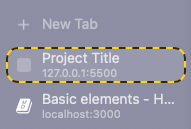
Just change the title to anything that you want such as your project title or ID. It is just a way for users to identify your website from other browser tabs.
HTML <body>
The bulk of your content will stay inside the <body> element. It looks something like this:
<body>
    <div class="content">

    ....
    </div>
</body>
To make sure that your content looks nice on a monitor and phone, put your content in between the:
<div class="content">
...
</div>
element. We have developed some styling to make sure that the content has some padding so it does not flush against the edge of the screen. However, you don't have to, or configure it to your liking. This is up to personal choice.
Just remember that if you want to add some content, you should add it inside the <body> element. If you need padding for your content to look nice, add it in between the <div class="content">
HTML headings
In HTML, there are six different level of headings element. They are:
<h1></h1>
<h2></h2>
<h3></h3>
<h4></h4>
<h5></h5>
<h6></h6>
If you look at the template, you should see that the Project title is in between a <h1> tag. In HTML, the headings is usually use to communicate clearly the hierarchy of text and often used as a way to mark the level of important of a title.
In this template, more specifically, we use:
<h1>to mark the project title and should only be used once at the top of your website.<h2>to mark section headers<h3>to mark sub-section headers- And so on, if you need headers for further sub-sections
This keep the text hierarchy clear and easy to maintain. Take a bit of your time to tweak the template and play with it to understand more about the styling of each headings. It will be helpful as you further design your website.
HTML sectioning
We section thing in a HTML by using the <div> element. You should see this happen a lot in the template. Let say if I want to designate some content as belong to the first section. I do:
<div id="section-1">
    <h2> 1. Section 1</h2>
    <p> Some text go here </p>
</div>
The id attributes is what is used to identified the section, it will be very important later on so we can use it as a way to link our reference to this section.
You can nest multiple <div> within each other if you want to create sub-sections to sub-sections to so on. However, do be aware that as you nest more and more <div> within each other, your website can get more and more convoluted and hard to maintain. We suggest keep the nesting to minimal.
Text, Link and List
In HTML, there is various ways to display text, but there is only 3 main basic one that you need to know:
<p></p> - use for paragraph
<a></a> - use for link
<li></li> - use for list items
Text
It is quite straightforward to add text on the website, you just have to put the content that you want to display in between the <p> tag. For example:
<p>
    Vitae proin sagittis nisl rhoncus mattis rhoncus urna neque viverra.
</p>
Place it as whereever you wish, but usually it should be within a div of a particular section.
Link
To add a link, you use the <a> element. Here is an example of a simple link that point to the section-1 we created earlier.
<a href="#section-1">
the text that represent your link
</a>
The href attribute is used to specify the url / path to a location within or outside of the website. In this case, the href contains the path to an element on the website. Please pay attention to the # in front of the section-1. This is important as all id name need to be prefixed with a # for the href to work properly. You can also point to a link out of our template by doing:
<a href="https://www.google.com/" target="_blank">
the text that represent your link
</a>
The attributes target="_blank" will prevent the link open up an external website on the tab you are using. It will open the external website on a new browser tab instead. It makes for better user experience. You don't have to do this for link that point to iternal section within your website.
The text in between the tag is basically what you see as the classic underlined blue link text on most website out there. It is just a representation for the linke without it being outright the url itself.
List
There are two main ways to display a list of thing on a website. First is an unordered list:
<ul>
    <li> Item 1 </li>
    <li> Item 2 </li>
</ul>
The second one is an ordered list:
<ol>
    <li> Item 1 </li>
    <li> Item 2 </li>
</ol>
Experience for yourself what is the difference between them, but it should be quite obvious how they are different.
Team Member Component
The team member compoment / element is a custom web component specific to this template that we have built to simplify your portfolio development process. You can see the detail of its implementation in the components/team-member folder. In another word, you can't "Google" this element / component, so don't waste your time on that.
Here is the example presented to you in the template:
<div class="team-member-wrapper">
  <team-member
      avatar="assets/blackranger.png"
      name="Black"
      department="Mechanical Engineering"
      year="1993">
  </team-member>

  .... other elements ....
</div>
Let break it down into individual components to understand how to use this component correctly.
The wrapper
The <div> element act as a wrapper around the content inside, this element was created for aesthetic purposes to help with all the <team-member> component layout. You can see its styling in the team-member.css file in the component folder.
How to use this component
You have 4 attributes to take note of:
avatar: the link to the person portrait.name: the name of the person.department: the home department of the person.year: the year you matriculate.
It is quite self-explanatory. You can list as many component as you want inside the <div> element and it will all be automatically nicely organised for you. It does not need to be 5, it can be 2 it can also be 6, it depends on your team size and how many <team-member> you add.
To add your portrait, take a nice and bright looking photo of yourself, and add it to the assets folder. Then you just have to link to that portrait as shown in the example template.
We suggest deleting and adding a few <team-member> components to get yourself familiar with how it works.
Table of Contents Component
This is the first component that was not fully built by us and instead relying on an external web component library called Shoelace. Shoelace provide a very handy way to design website with minimal dependency and no need to download anything.
The shoelace component is already preloaded as it is on the template, so there is no need for you to do anything extra to use it. You can visit the link above to see what other component you would maybe like to use. This is for more advanced developer, and you don't have to explore if you don't want to.
All the shoelace components / elements will have this following syntax <sl-xxxxx> with the acronym sl prefix in front.
Here is how table-of-content components look like in the template:
<div class="table-of-content">
  <h2>Table of Contents</h2>
  <sl-tree>
    <sl-tree-item expanded>
      <a href="#section-header-1">1. Section Header 1</a>
      <sl-tree-item>
        <a href="#sub-section-1-header-1">1.1. Sub-section Header 1</a>
      </sl-tree-item>
      <sl-tree-item>
        <a href="#sub-section-1-header-2">1.2. Sub-section Header 2</a>
      </sl-tree-item>
    </sl-tree-item>

    <sl-tree-item expanded>
      <a href="#section-header-2">2. Section Header 1</a>
      <sl-tree-item>
        <a href="#sub-section-2-header-1">2.1. Sub-section Header 1</a>
      </sl-tree-item>
      <sl-tree-item>
        <a href="#sub-section-2-header-2">2.2. Sub-section Header 2</a>
      </sl-tree-item>
    </sl-tree-item>

    <sl-tree-item>
      <a href="#references">References</a>
    </sl-tree-item>
  </sl-tree>
</div>
As with previous component, the div element is used for styling purposes. So we can ignore it here. Same with the h2 heading as it just dipslay the title. The actual main implementation of the table of contents start with the <sl-tree> element.
Shoelace tree element
We are using the tree element in Shoelace to help us with structuring our table of contents. There are only 2 component you need to be awared of:
<sl-tree></sl-tree>
<sl-tree-item></sl-tree-item>
The <sl-tree> is only used once as the wrapper around all of the <sl-tree-item>. We will pay more focus on the <sl-tree-item>.
In its most simple form, the <sl-tree-item> can be thought of a list item. Whatever is inside that element will be displayed as one list item for example:
<sl-tree>
    <sl-tree-item> Item 1</sl-tree-item>
    <sl-tree-item> Item 2</sl-tree-item>
</sl-tree>
This should remind of you the standard structure of the <ul> and <li> pair in the Basic elements section.
The tree allow us to nest an item within another item like so:
<sl-tree>
    <sl-tree-item>
      Item 1

      <sl-tree-item> Item 1.1 </sl-tree-item>
      <sl-tree-item> Item 1.2 </sl-tree-item>

    </sl-tree-item>

    <sl-tree-item> Item 2</sl-tree-item>
</sl-tree>
If you write the above code into the template, you should that the Item 1 now has a drop down option. And if you click onto it, it will expand to show the Item 1.1 and Item 1.2. If you want it to be expanded by default, like how we have our table content in the template, you just simply add the attribute expanded to the root item:
<sl-tree>
    <sl-tree-item expanded>
      Item 1

      <sl-tree-item> Item 1.1 </sl-tree-item>
      <sl-tree-item> Item 1.2 </sl-tree-item>

    </sl-tree-item>

    <sl-tree-item> Item 2</sl-tree-item>
</sl-tree>
To complete our table of content component, we need to add the appropriate like referencing to each of our sections. To do so we just simply change the item text to the appropriate link <a> element.
<sl-tree>
    <sl-tree-item expanded>
      <a href="#section-header-1">1. Section Header 1</a>

      <sl-tree-item>
        <a href="#sub-section-1-header-1">1.1. Sub-section Header 1</a>
      </sl-tree-item>

      <sl-tree-item>
        <a href="#sub-section-1-header-2">1.2. Sub-section Header 2</a>
      </sl-tree-item>

    </sl-tree-item>

    <sl-tree-item>
      <a href="#references">References</a>
    </sl-tree-item>
</sl-tree>
Please familiarize yourself with how to use the component by creating different nesting level of content and adding and modifying them to your liking.
Table Component
The table component will be the first component that require you to touch some Javascript. It is a bit harder to work with relative to other component, but don't worry, as long as you follow the tutorial carefully, it will just be some basic copy and paste job.
On the surface, here is what the table component looks like:
<table-component subtitle="Table: Demo table">
  <div id="table-1"></div>
</table-component>
There is one important thing to take note of, that is the table id. This is very important for the table to work so please pay attention to it.
If you open up the javascript file in components/table-component/table-component.js. You should see something that looks like this:
new gridjs.Grid({
  columns: ["Name", "Email", "Phone Number"],
  data: [
    ["John", "john@example.com", "(353) 01 222 3333"],
    ["Mark", "mark@gmail.com", "(01) 22 888 4444"],
    ["Eoin", "eoin@gmail.com", "0097 22 654 00033"],
    ["Sarah", "sarahcdd@gmail.com", "+322 876 1233"],
    ["Afshin", "afshin@mail.com", "(353) 22 87 8356"],
  ],
}).render(document.getElementById("table-1"));

class TableComponent extends HTMLElement {
  static get observedAttributes() {
    return ["subtitle"];
  }

  constructor() {
    super();
    this.attachShadow({ mode: "open" });
  }

  connectedCallback() {
    this.render();
  }

  attributeChangedCallback(name, _, newValue) {
    this[name] = newValue;
  }

  render() {
    const div = document.createElement("div");
    div.innerHTML = `
    <slot></slot>
    <sub>${this.subtitle}</sub>
    <style>
      :host {
        display: block;
        text-align: center;
      }

      sub {
        font-size: 1rem;
        font-style: italic;
      }
    </style>
  `;

    this.shadowRoot.appendChild(div);
  }
}

customElements.define("table-component", TableComponent);
We only need to focus on this section:
new gridjs.Grid({
  columns: ["Name", "Email", "Phone Number"],
  data: [
    ["John", "john@example.com", "(353) 01 222 3333"],
    ["Mark", "mark@gmail.com", "(01) 22 888 4444"],
    ["Eoin", "eoin@gmail.com", "0097 22 654 00033"],
    ["Sarah", "sarahcdd@gmail.com", "+322 876 1233"],
    ["Afshin", "afshin@mail.com", "(353) 22 87 8356"],
  ],
}).render(document.getElementById("table-1"));
The rest is just template code, and you don't need to pay attention to it. You can see at the bottom of the code, the id of table-1 is mentioned again. This is how we attach our javascript code to the table component we use in our HTML.
Creating custom table
From a brief look, it should be obvious where the data that get display on the table come from, it is under the data field. Now, we will teach you how to create a new table using the example above.
First, in the index.html create a new table component like so:
<table-component subtitle="Table: Example table">
  <div id="example"></div>
</table-component>
Notice how the the id is now example.
Next we will copy the code exactly as above into the table-component.js file, so that you look something like this:
new gridjs.Grid({
columns: ["Name", "Email", "Phone Number"],
data: [
["John", "john@example.com", "(353) 01 222 3333"],
["Mark", "mark@gmail.com", "(01) 22 888 4444"],
["Eoin", "eoin@gmail.com", "0097 22 654 00033"],
["Sarah", "sarahcdd@gmail.com", "+322 876 1233"],
["Afshin", "afshin@mail.com", "(353) 22 87 8356"],
],
}).render(document.getElementById("table-1"));
// template code down here ...
Now, focus on the block of code that we just paste and modified it to point to the example instead.
// ....

new gridjs.Grid({
  columns: ["Name", "Email", "Phone Number"],
  data: [
    ["John", "john@example.com", "(353) 01 222 3333"],
    ["Mark", "mark@gmail.com", "(01) 22 888 4444"],
    ["Eoin", "eoin@gmail.com", "0097 22 654 00033"],
    ["Sarah", "sarahcdd@gmail.com", "+322 876 1233"],
    ["Afshin", "afshin@mail.com", "(353) 22 87 8356"],
  ],
}).render(document.getElementById("example"));

// ...
Now, if we save the change made to the HTML and the change made to the Javascript file, we should see a new table that look exactly identical to our template table. Congratulation, you just use the table component successfully.
Now, to customize the table to your needs, you can change the columns to add or delete columns as you wish, just makre sure that the data you provided has the same length as the number of collumns that you have.
// ....

new gridjs.Grid({
  columns: ["Name", "Email"],
  data: [
    ["Red Ranger", "red@mpr.com"],
    ["Green Ranger", "green@mpr.com"],
  ],
}).render(document.getElementById("example"));

// ...
This table component is based on another library called Grid.js. You can go into the documentation to epxlore more option that the library offered. You can do quite advanced thing like offering searching ability, ordering of data and more.
Image Component
The image component is a simple component that can be used to quickly display an image with an attached subtitle. The format is as follow:
<image-component
    tag="image"
    source="assets/requirement.png"
    subtitle="Image 1: iDP suggested pathway"
></image-component>
The image componet has 3 main attributes:
tag: this is the same as theidattributes in thedivelement, you can use this with<a>link to point to the picture.source: this is the source of your image, it can be an image in theassetsfolder like in the example, or it could also be an url pointing to an image from an external page.subtitle: add subtitle text under the image.
This is a very simple component that you can also create through raw html, but if you don't need much modifications, using this component would be faster and cleaner.
Video Component
The video component is very similar to the image component, with the difference is that it display video instead. This is actually how video from site such as Youtube can be embedded in different webpage. The format is as follow:
<video-component
    tag="rick"
    source="https://www.youtube.com/embed/dQw4w9WgXcQ"
    subtitle="Video: Never gonna give you up?"
></video-component>
The image componet has 3 main attributes:
tag: this is the same as theidattributes in thedivelement, you can use this with<a>link to point to the picture.source: this is the source of your video, in this template, we encourage you to upload the video you want as a listed or unlisted video on Youtube first. Then, you can use the link provided from Youtube to your video as the source.Putting a video into theassetsfolder and then put the link to the source, may or may not work. It also bad practice as Github only meant to host small static file, so you might meet their file size restriction.subtitle: add subtitle text under the video.
Note
The video might not be able to render properly when you are using the local server. This is because Youtube is protecting your browser and their videos from potential exploit. Don't worry if it doesn't show the video properly on your website while developing. As long as the link is correct, it will load just fine once it is deployed to Github.
References Component
The references component format is as follow:
<div id="references" class="references">
  <sl-divider></sl-divider>
  <h2>References</h2>
  <ul>
    <li>
      Brody, J. E. (2007, December 11). Mental reserves keep brain agile. The New York Times. Retrieved from
      http://www.dowjones.com/factiva/
    </li>
    <li>
      Chamberlin, J., Novotney, A., Packard, E., & Price, M. (2008, May). Enhancing worker well-being: Occupational
      health psychologists convene to share their research on work, stress, and health. Monitor on Psychology,
      39(5), 26-29.
    </li>
    <li>
      Jones, T. J., & Fields, N. (2003). Emotional quotient and personality. E-Journal of Applied Psychology, 2(2),
      38-45. Retrieved from http://ejournalappliedpsyc/index.php/ejap
    </li>
  </ul>
</div>
The only part that you should modifi is between the <ul> tag. You simply just need to add an entry as follows:
<li>
    your reference entry
</li>
in between the <ul> tag as shown above and you are good to.
Pushing the changes you made to Github
Once you are done with all of the changes that have made to your website, open up your command line in your VSCode by pressing Ctrl + ~. Enter the following commands into the command line one by one, and press enter after each of them to execute the command.
git add -A
This will add all the new files you have added to your codebase into the commit.
git commit -am "A short description of your commit"
This will commit all the changes that you have made to the codebase. Replace the text to what you want so that you can easily keep track of the change you have made.
git push origin
This will push the commit that you have made to Github, and automatically reflect the changes to your website for you.It should take around 1 minute or less to see the new change being reflected on your website.
Chapter 2: Optional enhancement
In this chapter, we will be learning how to use more advanced components to enhance your web report. We will learn how to:
- Split your report into seperate sections and tabs for ease of readability.
- Import components and code as you need them.
- Use Chart.js to create simple charts.
- Make interactive diagram with Mermaid.js.
- Render 3D object such as your CAD using Three.js.
To view what the template for the optional enhancement, you can visit the link below:
The source code is available here
Make your report into multiple pages
In this section, we will learn how to split the content up into their respective pages so that you can more neatly organised your content for readability.
1. Create a new content page
So we have learn from Chapter 1 that when you visit your web report on Github, it will serve the index.html file back down to your browser and the rest of your report is render from there. However, if you try to cramp your whole report into only one page, it can become quite lengthy and sluggish to read. Overall, it is not just an ideal web experience.
It is in fact quite trivial to split up the content into their own respective pages. If you look at the template repo, you can see that to create a new page, we can simply just create a new folder and put another index.html file inside it.
Take for example the chart folder. If you look inside, you can see that there are 2 files:
chart.jsindex.html
So when you visit the path:
https://edic-nus.github.io/advanced/chart/
It will render the index.html file inside the chart folder on your browser. You can try the same thing for /diagram and /3d-render.
So to summarize, to create a new page for your report. You just simply have to create a new folder and put a index.html file inside it. The name of your folder will be the name of your path.
Warning
This should come as something obvious but you should not use a name with a special character (eg. space, tab, etc.) in them, as it might have trouble linking the path correctly. As a standard practice, just use a one word name such as
aboutordiagram. If you need more than one word, use-to connect the words instead:about-us.
2. Using template-page.html
Now that you know how creating a new page works, you must be wondering what to put into the index.html file. No worry, we have provided you with a template so you can just copy paste everytime you create a new page. You can find it in our demo code under the name template-page.html. Let's take a look at what is inside the template and how to use it.
<!DOCTYPE html>
<html lang="en">

<head>
  <meta charset="UTF-8">
  <meta name="viewport" content="width=device-width, initial-scale=1.0">
  <meta http-equiv="X-UA-Compatible" content="ie=edge">
  <title>Project Title</title>
  <link rel="icon" href="./favicon.ico" type="image/x-icon">
  <link rel="stylesheet" href="https://cdn.jsdelivr.net/npm/@shoelace-style/shoelace@2.16.0/cdn/themes/light.css" />
  <script type="module"
    src="https://cdn.jsdelivr.net/npm/@shoelace-style/shoelace@2.16.0/cdn/shoelace-autoloader.js"></script>

  <!-- You can add what components you want to include here  -->
  <link rel="stylesheet" href="./index.css">
  <link rel="stylesheet" href="./components/scroll-to-top/scroll-to-top.css">
  <script src="./components/scroll-to-top/scroll-to-top.js"></script>

  <!--  -->
</head>

<body>
  <div class="content">
    <sl-button href="../">Back</sl-button>

    <sl-button class="scroll-to-top" variant="primary" size="medium" circle onclick="scrollToTop()">
      <sl-icon name="arrow-up" label="Settings"></sl-icon>
    </sl-button>
</body>

</html>
As you can see, it is quite a short file. For the most parts, you can ignore all of it. There are only 2 things that you should pay attention to, that is:
- How to add components that you need
- How the back button works
2.1. How to add components that you need
Look at this portion of the code:
<!-- You can add what components you want to include here  -->
<link rel="stylesheet" href="./index.css">
<link rel="stylesheet" href="./components/scroll-to-top/scroll-to-top.css">
<script src="./components/scroll-to-top/scroll-to-top.js"></script>

<!--  -->
There are 2 kinds of import that we utilize that is <link> and <script>.
We use:
<link rel="stylesheet" href="./index.css">
to import the css files needed to add styling to your web page. Here, you can see that we are importing the style from the index.css file and the scroll-to-top.css file in the components folder.
We use:
<script src="./components/scroll-to-top/scroll-to-top.js"></script>
to import the js files needed to run the javascript for that web page.
Please note that, you would have to do this for every new index.html file you created, as importing on one index.html does not get share with other index.html files in different folders / paths.
One of the important thing to understand is how path syntax works to tell the element in HTMl to figure out where your file is located relative to each other.
./is used to specify looking at the current folder and locate the file. For example:./components/scroll-to-top/scroll-to-top.cssmeans to look in the current folder, findcomponentsfolder, go intocomponentsfolder, findscroll-to-topfolder, go intoscroll-to-topfolder, and findscroll-to-top.cssfile.../is use to go 1 folder above the current folder. For example, if you are currently in thescroll-to-topfolder, then../scroll-to-topis one folder above / outside of it, that would be thecomponentsfolder.
I know it could be a bit confusing, but the best way to get used to it is just try to add components yourself to see how the path would work, and if you are stuck you can ask ChatGPT for help in figuring out how to import your files correctly.
With that out of the way, you should notice by now, that with our current path declaration, our template would not be able to properly import index.css file when it is used inside another folder. That is because it used ./index.css. But when inside another folder, such as chart, it actually needs to be ../index.css instead, because the file index.css is in a folder one level above the chart folder. So do pay attention to this when trying to import file from different location.
2.2. How the back button works
Let look at the code:
<sl-button href="../">Back</sl-button>
You should have noticed that we used a shoelace button from the introduction to Shoelace in previous chapter. However, you could also just use the default button provided by html, there is no different in functionality.
You should see that the href attribute use the same path syntax that we have discussed above. This is because navigating within a website is very similar to how you navigate between folders. So a href="../" just simply mean to go one folder above, or in another words, go back to our main folder that contains the entry index.html.
3. How to navigate between pages
Now that we roughly understand how path syntax works, let looks at how do we provide link from one page to another. If we open up the main entry index.html files, you can see the familiar Table of Contents code:
<div class="table-of-content">
  <h2>Table of Contents</h2>
  <sl-tree>
    <sl-tree-item expanded>
      <a href="./chart/">Chart</a>
      <sl-tree-item>
        <a href="./chart/#pie-doughnut">1. Pie and Doughnut Chart</a>
      </sl-tree-item>
      <sl-tree-item>
        <a href="./chart/#bar">2. Bar Chart</a>
      </sl-tree-item>
      <sl-tree-item>
        <a href="./chart/#line">3. Line Chart</a>
      </sl-tree-item>
      <sl-tree-item>
        <a href="./chart/#scatter">4. Scatter Chart</a>
      </sl-tree-item>
    </sl-tree-item>

    <sl-tree-item>
      <a href="./diagram/">Interactive diagram</a>
    </sl-tree-item>

    <sl-tree-item>
      <a href="./3d-render/">3D Render</a>
    </sl-tree-item>
  </sl-tree>
</div>
What to focus on here is the value we provided to the href attribute. Using our previous knowledge regarding path, it should be easy to see that ./chart/ means to go to the chart folder or equivalently the /chart/ path in the url. As long as you understand this concept, the rest is similar to what we have learnt in Chapter 1. To specify a id we want to target in another page, we just have to add the #id syntax in the url as shown above.
Working with Chart.js
To make the process of creating chart simple and streamline, we will utilize Chart.js library. If you open up the index.html in the chart folder. You should see the following:
<!DOCTYPE html>
<html lang="en">

<head>
  .....

  <!-- You can add what components you want to include here  -->
  <link rel="stylesheet" href="../index.css">
  <link rel="stylesheet" href="../components/scroll-to-top/scroll-to-top.css">
  <script src="../components/scroll-to-top/scroll-to-top.js"></script>

  <script src="https://cdn.jsdelivr.net/npm/chart.js"></script>

  <!--  -->
</head>

<body>
  <div class="content">
    <sl-button href="../">Back</sl-button>

    <h2 id="pie-doughtnut">1. Pie and Doughnut Chart</h2>
    <div style="display: flex; justify-content: space-around;">
      <div style="width: 45%;">
        <canvas id="pie-chart"></canvas>
      </div>
      <div style="width: 45%;">
        <canvas id="doughnut-chart"></canvas>
      </div>
    </div>

    <br />
    <h2 id="bar">2. Bar Chart</h2>
    <div>
      <canvas id="bar-chart"></canvas>
    </div>

    <br />
    <h2 id="line">3. Line Chart</h2>
    <div>
      <canvas id="line-chart"></canvas>
    </div>

    <br />
    <h2 id="scatter">4. Scatter Chart</h2>
    <div>
      <canvas id="scatter-chart"></canvas>
    </div>

    <sl-button class="scroll-to-top" variant="primary" size="medium" circle onclick="scrollToTop()">
      <sl-icon name="arrow-up" label="Settings"></sl-icon>
    </sl-button>

    <script src="./chart.js"></script>
</body>

</html>
We import the Chart.js library by simply adding the following line:
<script src="https://cdn.jsdelivr.net/npm/chart.js"></script>
Now, we will create elements where we will draw the chart using Javascript later. To do that we use the following syntax:
<div>
    <canvas id="something-chart></canvas>
</div>
The id can be anything you want, but remember that it should be unique to each graph because that is how you differentiate them in the Javascript code section later.
You would also notice that differnt from our usual way of import, we need to import the chart.js file at the bottom of the <body> element:
    ...

    <sl-button class="scroll-to-top" variant="primary" size="medium" circle onclick="scrollToTop()">
      <sl-icon name="arrow-up" label="Settings"></sl-icon>
    </sl-button>

    <script src="./chart.js"></script>
</body>
This is because Javascript cannot grab an element if it has not been initialized yet. As we will see in the subsequent code in chart.js, it needs to know that pie-chart exist, before it can grab that elements, so we cannot declare the import before the declaration of the elements. In general, people tend to import Javascript code at the bottom of the body for this reason, but for organisation purpose, we would like to put thing related together closer to each other unless we have no other choice.
Now open up the chart.js file. Take this sample code:
const PieCtx = document.getElementById("pie-chart");
const DoughnutCtx = document.getElementById("doughnut-chart");

const PieData = {
  labels: ["Red", "Blue", "Yellow"],
  datasets: [
    {
      label: "My First Dataset",
      data: [300, 50, 100],
      backgroundColor: [
        "rgb(255, 99, 132)",
        "rgb(54, 162, 235)",
        "rgb(255, 205, 86)",
      ],
      hoverOffset: 4,
    },
  ],
};

new Chart(PieCtx, {
  type: "pie",
  data: PieData,
});

new Chart(DoughnutCtx, {
  type: "doughnut",
  data: PieData,
});
The PieCtx constant holds the container which is the <canvas id="pie-chart"></canvas>, this is how we tell Javascript which <canvas> to draw what which is why we need the id to be unique.
Then we define what the data we want the chart to render. We will go indepth into this in a bit.
Finally, we will render this chart. To do this the syntax is:
new Chart(ctx, {
    type: "pie",
    data: PieData
})
Where ctx stands for context, in another word, the <canvas> element that you grab. type refer to chart type you want to render, and finally the data you want the chart to render.
Now, we will go more indepth regarding the configuration of each graph, you could also learn more directly from here
1. Pie and Doughnut Chart
const PieData = {
  labels: ["Red", "Blue", "Yellow"],
  datasets: [
    {
      label: "My First Dataset",
      data: [300, 50, 100],
      backgroundColor: [
        "rgb(255, 99, 132)",
        "rgb(54, 162, 235)",
        "rgb(255, 205, 86)",
      ],
      hoverOffset: 4,
    },
  ],
};
Let break down what each of this fields means:
labels: the labels for your data, it should match with the number of data you havedatasets: the content of chartlabel: is the label for this particular dataset, it will make more sense in subsequent chartsdata: this is where you specify your data in an array, make sure you have same number of data as the labelsbackgroundColor: this is for aesthetic purpose, you can use any standard css color syntax. If you don't want any color variation, just delete this portion.hoverOffset: is just show how far should the offset from the center of the chart where the tooltip show when you hover over the chart
2. Bar Chart
const BarData = {
  labels: ["Jan", "Feb", "Mar", "Apr", "May", "Jun", "Jul"],
  datasets: [
    {
      label: "My First Dataset",
      data: [65, 59, 80, 81, 56, 55, 40],
      borderWidth: 1,
    },
    {
      label: "My Second Dataset",
      data: [23, 40, 67, 20, 79, 30, 80],
      borderWidth: 1,
    },
  ],
};
We can see that the datasets now have 2 set of data: My First Dataset and My Second Dataset.
This is why datasets is declared as an array of object. Because you can show one or more dataset on the same chart space.
borderWidth just specify how thick the border of the bar you want them to be.
3. Line Chart
const LineData = {
  labels: ["Jan", "Feb", "Mar", "Apr", "May", "Jun", "Jul"],
  datasets: [
    {
      label: "My First Dataset",
      data: [65, 59, 80, 81, 56, 55, 40],
      fill: false,
      tension: 0.1,
    },
    {
      label: "My Second Dataset",
      data: [23, 40, 67, 20, 79, 30, 80],
      tension: 0.1,
    },
  ],
};
fill: whether you want the area under the line to be filled or not.tension: whether you want to smooth out the turn at each data point. At 0, it will just be straightline connect at each data point.
4. Scatter Chart
const ScatterData = {
  datasets: [
    {
      label: "Scatter Dataset",
      data: [
        {
          x: 2,
          y: 4,
        },
        {
          x: 3,
          y: 2,
        },
        {
          x: 4,
          y: 5,
        },
        {
          x: 0.5,
          y: 5.5,
        },
      ],
      backgroundColor: "rgb(255, 99, 132)",
    },
  ],
};
Each data point in a scatter chart requires an x and y coordinates. We suggest that if you need to use a scatter graph, you should create a simple Python script maybe with the help of ChatGPT to convert all of your data to the format above and then just copy paste accordingly.
Working with Mermaid.js
Mermaid.js can be said to be the defacto standard when it comes to creating diagram using Domain Specific Language. In fact, if you have ever seen diagram being render on Github repository before, it is all thanks to mermaid.js.
This section won't be teaching you how to create diagram but only how to allow you to render those diagram. To learn how to create this beautiful diagram, you can read their document or use their Live Editor instead.
If you open the diagram folder, you should be able to see 3 files:
index.htmldiagram.jssvg-pan-zoom.min.js
In the index.html file, we import 2 things:
<script src="https://cdn.jsdelivr.net/npm/mermaid@11.2.1/dist/mermaid.min.js"></script>
<script src="svg-pan-zoom.min.js"></script>
The former is to import mermaid.js, the latter is to import the svg-pan-zoom library. Since this library have a bit of a problem being loaded from the CDN, we instead download it down to a file locally and name it as svg-pan-zoom.min.js.
The purpose of the svg-pan-zoom is allowing us to zoom in and out and pan around our diagram, which will allow you to draw bigger diagram without worrying that it is not readable. This is the main advantage over just taking a picture of your diagram. You don't have to use it if you don't want to, but it surely would make your report more interactive.
To render a mermaid chart, you just have to declare the <pre> element and give it the mermaid class. It will automatically be rendered.
Similar to the chart, we need to import diagram.js file at the bottom of the <body> element.
    ...

    <sl-button class="scroll-to-top" variant="primary" size="medium" circle onclick="scrollToTop()">
      <sl-icon name="arrow-up" label="Settings"></sl-icon>
    </sl-button>

    <script src="./diagram.js"></script>
</body>
We don't actually need to know what is happening in the diagram.js file as it is only glue code to help with stitching the svg-pan-zoom with mermaid.js library. Just remember to include all of this file if you decide to use mermaid.js to draw your diagram.
Working with 3D Render
To render 3D object such as your CAD in the format of .stl file, we will use the Three.js library. It is a very cool library that allows you to do mind-blowing graphic stuff in the browser. However, it is very out-of-scope for our purpose, so we have helped written a component script so you can just simply use it with minimal configuration to display your .stl file.
To use the 3D render component, we need to import the following into our index.html file.
<head>
  ...

  <script type="importmap">
  {
    "imports": {
      "three": "https://cdn.jsdelivr.net/npm/three@v0.166.1/build/three.module.js",
      "three/addons/": "https://cdn.jsdelivr.net/npm/three@v0.166.1/examples/jsm/"
    }
  }
  </script>
  <script type="module"
    src="https://cdn.jsdelivr.net/npm/@shoelace-style/shoelace@2.16.0/cdn/shoelace-autoloader.js"></script>

  ...

  <script type="module" src="./render.js"></script>
</body>
It is a bit more complicated than other module because of the three.js library. It is important that you make sure the import is in the order above for three.js to work properly. Don't forget the type="module" when importing the render.js file as it is necessary for the script to work properly.
To use the component, you just simply have to create a <div> with the id value that you want:
<div id="render1"></div>
Then, in the render.js file call the createRender function accordingly as shown.
createRender(
  "render1",
  400,
  [0, -1, 0],
  [0.05, 0.05, 0.05],
  [-Math.PI / 2, 0, 0],
  false,
  "../assets/benchy.stl",
);
It will render your .stl file in the specified <div>.
Now, let take a loot at what each of the arguments means, and how you can use them:
function createRender(
  id,
  height,
  position,
  scale,
  rotation,
  enableAxes,
  stlFilePath,
) {
id: is the id you gave to thedivelement that you want to render your.stlto.height: is the height in pixel of the view box of your object. You can adjust the width by modifying thedivwidth directlyposition: the position of your object in 3D space, in the following order [x , y , z]scale: same as position but for scaling, you will have to experiment to see what scale would work for you as some stl can be very big, and some can be very small.rotation: same as position and scale, but for the rotation angle of your object. It uses Euler angle. As a rule of thumb you should useMath.PI / 2as trial value because it equals to a rotation of 90 degree.enableAxes: whether you want to enable the X Y Z axis for debugging purposes or not.stlFilePath: this is the path to your.stlfile. Do note that Github has file size limitations to what you can upload there, so if your CAD is just too big in memory size, maybe it would be better if you upload it to some other storage method such as Google Drive or Dropbox and then provide the url to thatstlfile here. Otherwise, just put yourstlfile into theassetsfolder, and write the correct path to thatstlfile here.
Rendering 3D can be quite intensive on some more underpowered devices, so try to only use this component to show things that would highlight your effort instead of dumping every single CAD that you have here. Because remember, the user would need to download all of you CAD before they can view them, so it doesn't make sense to make user download 1GB worth of CAD to view it for only 5 seconds.
In another word, use this component prudently and responsibly.

